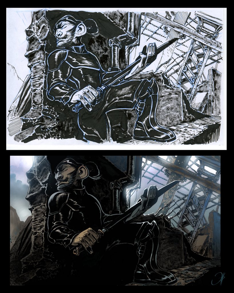
This is one of the ink tests I did when I was thinking on doing my next album that way. This is the main character design, but please don´t look at his huge ear! :P Thanks for all the support received.
Me mola de todas formas más la otra que me enviase. Con el color gana mucho, pero weno... ya sabes cómo me mola más a mi. Que por cierto... a mi me encanta esa oreja enorme y ese aire simiesco con las manos enormes y tal...
wow totally different feel to "OZ" I can't wait! Good luck from Tomm in Cartoon Saloon!!! (p.s. check out our new comic An Tain- I posted about it on my blog)
the draws are good for sure, but i'm not fond of your new color style. I think that kind of color is very common actualy in french comics. Your "ancient" style was the "fernandez style". But i may be wrong, i'm not drawer.
la piedra donde esta apuyado(o columna)a pillado la misma forma y expresión que su cara.no se si lo ves o sabes que te digo,parecen 2 caras...la suya y luego la otra,sabes?que es un comentario desde la envidia eh!no me hagas ni caso:)
Thanks a lot for your comments, muchas gracias. The ink test is , as it´s name say, only a test to evaluate the chances of doing that style. As I have said before, this tests lead me to do the new album on the same style as the previous ones (I agree with you Patrouchef, glad to read you here ;-)). Someday I will come back to inks , as I like to try styles and techniques, but by now it´s quite annoying for me , not to mention that it makes me work twice slowly. Aitor: El personaje principal se llama Kataoka Raijuro, y ya no puedo cambiarlo. ¡Por tu madre que no me hayas colado un nombre que signifique cualquier ridiculez! Orion: Creo que lo veo! :)
Enrique... Gracias antes de nada por mostrarnos estas cosas... nos creas ansiedad!!!! Y qué quieres que te diga.... a mí no me disgusta el tema de la oreja grande, es más lo veo muy equilibrado y de líneas fluídas. La cara (oreja incluída) es simplemente inquietante, atrayente... Mola! Saludos....
P.S. Pero si me quieres convencer de lo contrario... pues nada... postea la versión definitiva... eh...!!! ;)
ANTONIO: Vaya truco! Picarme para ir sacando material! :) Aún no puedo sacar nada decente de la version final, iré sacando más pruebas y demás. Muchas gracias.
Está bien verte en estilos de acabado diferentes, Enrique (y también mola este color). En cuanto al dibujo, ¿tienes idea de hacer las proporciones tan deformadas? Lo digo porque, por ejemplo, la mano que sujeta el filo de la espada tiene la misma longitud que media pierna.
Sedyas: La verdad es que pensaba hacer todo aún mucho más deformado y caricaturesco (conoces el blog de Patrick Mate?), que es lo que más me gusta, pero la historia quedaría un poco fuera de contexto, así que he tirado por algo menos distorsionado, más proporcionado. Un saludo, Frad y Yacin.:)
sorry my spanish is rotten( my english not really better but i don t know if you speak french). I'm a big fan of your work, yours draws are fantastic and your colours too. You're a big artist. In fact i write to you because i love "Bande dessinée", comics (how do you say that in spanish? ), and i appreciated especially works of artists who have a really personnal style, like you (or in France: David Sala, G Sorel, E Marini...). And i dream about a book of interviews about this artists work. Interview about technics, something really practical, more about you're choice of framing, colours, papers than you re relation with you writer or you re editor. A books of advice by great names of the comics.
Do you think that you can be interested by this project? you can write me at : jeanyvesarnaud@yahoo.fr
.Hey Enrique fantastico tu arte , realmente impresiona la calidad que despide tu trabajo ,....vi unas portadas del mago de Oz , y son soberbias....Felicitaciones compañero!
Just had to say hi as i've had the first OZ book since last years Annecy Film Festival. The weird thing was i never googled up your name until now. So once i found this i just had to say something. Esspecially since your work really is so immensely rich in design and color. Also your work reminds me of the best grafiti work out there as your designs have to be taken in! As a viewer you can't see what's going on and then the image hits you. I love that kind of work you really have to read it and it opens up to you in such a tremendous way! Anyways keep on doing your really nice immensely stilezed super works. Keep on pushing that envelope!
muy bueno todo enrique!! me encanta tu manera de resolver los personajes y de estilizar las formas. estuve laburando aca en argentina como asistente de animación en "Nocturna", asi q he visto mas cosas tuyas, excelente! bueno, te mando mi reciente blog: http://opusbou.blogspot.com para q me digas q te parece un saludo, sanBou
ouiiiiiii...esto esta de pm ~! ya veo que sigues con tanto talento o mas ~! el claroscuro en este es genial ~ k tal te va todo maestro ? k hace mucho k no se nada de ti .

38 comments:
This looks very interesting! Colour version is really great.
Me mola de todas formas más la otra que me enviase. Con el color gana mucho, pero weno... ya sabes cómo me mola más a mi. Que por cierto... a mi me encanta esa oreja enorme y ese aire simiesco con las manos enormes y tal...
Enseña más, anda!
t.
wow totally different feel to "OZ" I can't wait! Good luck from
Tomm in Cartoon Saloon!!!
(p.s. check out our new comic An Tain- I posted about it on my blog)
me encanta como has resuelto las luces. genial, como siemrpe.
looks marvelous! the coloring is simply beautiful!
BEAutiful!!
the draws are good for sure, but i'm not fond of your new color style. I think that kind of color is very common actualy in french comics. Your "ancient" style was the "fernandez style". But i may be wrong, i'm not drawer.
See you ;-)
Great stuff!
la piedra donde esta apuyado(o columna)a pillado la misma forma y expresión que su cara.no se si lo ves o sabes que te digo,parecen 2 caras...la suya y luego la otra,sabes?que es un comentario desde la envidia eh!no me hagas ni caso:)
Thanks a lot for your comments, muchas gracias.
The ink test is , as it´s name say, only a test to evaluate the chances of doing that style. As I have said before, this tests lead me to do the new album on the same style as the previous ones (I agree with you Patrouchef, glad to read you here ;-)).
Someday I will come back to inks , as I like to try styles and techniques, but by now it´s quite annoying for me , not to mention that it makes me work twice slowly.
Aitor: El personaje principal se llama Kataoka Raijuro, y ya no puedo cambiarlo. ¡Por tu madre que no me hayas colado un nombre que signifique cualquier ridiculez!
Orion: Creo que lo veo! :)
beautiful things!
Enrique... Gracias antes de nada por mostrarnos estas cosas... nos creas ansiedad!!!! Y qué quieres que te diga.... a mí no me disgusta el tema de la oreja grande, es más lo veo muy equilibrado y de líneas fluídas. La cara (oreja incluída) es simplemente inquietante, atrayente... Mola!
Saludos....
P.S. Pero si me quieres convencer de lo contrario... pues nada... postea la versión definitiva... eh...!!! ;)
Beautiful ! You have so many secret skills ;) !
ANTONIO: Vaya truco! Picarme para ir sacando material! :) Aún no puedo sacar nada decente de la version final, iré sacando más pruebas y demás. Muchas gracias.
TSUKA: Thanks! Great to read you here. :)
Muy buen trabajo... Ahora tengo ganas de ver más... y un nivel más de envidia sana... jejeje. Suerte
Está bien verte en estilos de acabado diferentes, Enrique (y también mola este color).
En cuanto al dibujo, ¿tienes idea de hacer las proporciones tan deformadas? Lo digo porque, por ejemplo, la mano que sujeta el filo de la espada tiene la misma longitud que media pierna.
Un saludo
-Sed
Sedyas: La verdad es que pensaba hacer todo aún mucho más deformado y caricaturesco (conoces el blog de Patrick Mate?), que es lo que más me gusta, pero la historia quedaría un poco fuera de contexto, así que he tirado por algo menos distorsionado, más proporcionado.
Un saludo, Frad y Yacin.:)
Me E N C A N T A esta prueba.
Hi Enrique,
sorry my spanish is rotten( my english not really better but i don t know if you speak french).
I'm a big fan of your work, yours draws are fantastic and your colours too. You're a big artist.
In fact i write to you because i love "Bande dessinée", comics (how do you say that in spanish? ), and i appreciated especially works of artists who have a really personnal style, like you (or in France: David Sala, G Sorel, E Marini...).
And i dream about a book of interviews about this artists work. Interview about technics, something really practical, more about you're choice of framing, colours, papers than you re relation with you writer or you re editor.
A books of advice by great names of the comics.
Do you think that you can be interested by this project?
you can write me at : jeanyvesarnaud@yahoo.fr
soory for this too long message
.Hey Enrique fantastico tu arte , realmente impresiona la calidad que despide tu trabajo ,....vi unas portadas del mago de Oz , y son soberbias....Felicitaciones compañero!
That's wicked!!:)
Hey Enrique ,
amazing works...
specially like most your sneak peek...
:)
Muy bueno, Enrique. Gracias por compartir tus proyectos.
Esto promete, esto promete!!
Me gusta el careto del Kataoka.
Realmente no tiene nada que ver con Oz.
Continue deleitándonos Master Enrique!!
Saludos!!
Just had to say hi as i've had the first OZ book since last years Annecy Film Festival. The weird thing was i never googled up your name until now. So once i found this i just had to say something. Esspecially since your work really is so immensely rich in design and color. Also your work reminds me of the best grafiti work out there as your designs have to be taken in! As a viewer you can't see what's going on and then the image hits you. I love that kind of work you really have to read it and it opens up to you in such a tremendous way! Anyways keep on doing your really nice immensely stilezed super works. Keep on pushing that envelope!
Kind regards,
Lars, from the Netherlands.
Que decir despues de tanto comentario. Pues nada solo una sonrisa :-)
muy bueno todo enrique!!
me encanta tu manera de resolver los personajes y de estilizar las formas.
estuve laburando aca en argentina como asistente de animación en "Nocturna", asi q he visto mas cosas tuyas, excelente!
bueno, te mando mi reciente blog:
http://opusbou.blogspot.com
para q me digas q te parece
un saludo, sanBou
Just OUtch. L'encrage, le design, le mood, j'aime tout.
J'ai hate de voir "l'objet" fini.
Gate.
ouiiiiiii...esto esta de pm ~!
ya veo que sigues con tanto talento o mas ~! el claroscuro en este es genial ~
k tal te va todo maestro ? k hace mucho k no se nada de ti .
HIJOS DE PUTA NO PONGAN TANTA MIERDA ES DAÑINO PARA LA SALUD MENTAL NOSOTROS QE NO SOMOS JENIOS NI NERF COMO USTEDES MIERDAS
CHIT MADA FAKER SANA PAPICK MIERDA
I am impressed with this blog work and skill you made here. Thank you so much
I am really Happy that you writing content article like this. its greattt
I have usually enjoyed checking out this site. Great work you showcase here
I read a lot of stuff here and I like the way you write. Good job! Make another one
Thanks for sharing valuable post
Post a Comment